Thursday, November 16, 2006
About Me

- Name: Erin
- Location: Grand Ledge, Michigan, United States
I'm a 28 year old mom to one amazing little man. I stay at home with my son and fill my days with as much 'fun and adventure' that a 3 year old can dish out! I'm married to Chris, my sweet husband, who is an amazing daddy to our sweet Jay-boy. I couldn't be happier :)


2 Comments:
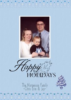
I think that it is really really cute! I love that it is a simple, uncluttered layout. I also like that you didnt make your photo the entire card front. (I have seen this done and I think it looks... vain... i dont know why, that's just me), you got the perfect size.
That little tree on the right isnt even necessary. I think that it might look better without it, but it is kinda cute there.
I think you rocked it! It's the traditional family photo card, but then you added some subtle "cool" in the border with that funky paper/ribbons. So Cute!
*cough*... well if asked for an opinion I generally give one... I promise to stick to a yes or a no in future. haha
I like it! Wish I had the skill to make my own digi cards!
Post a Comment
<< Home